

You’ve got a product to sell, but the world won’t just come to your door. You need a store that works—one that pulls in customers, holds their attention, and gets them to buy. Building an e-commerce site is no small task, but it’s the one thing standing between you and the sales you’re after.
In this guide, we’ll show you how to build a site that sells. From your homepage to your checkout, we’ll cover every step. If you want to create a store that sticks in people’s minds and makes their wallets open, keep reading.
Table of Contents
- How to Choose the Right E-Commerce Platform for Your Business
- Key Things to Remember When Building Your E-Commerce Site
- Designing your first eCommerce site
- How to Create a Header That Works for Your E-Commerce Site
- How to Create an Engaging Homepage for Your E-Commerce Site
- How to Design a High-Converting Product Page for Your E-Commerce Store
- How to Make E-Commerce Category Pages User-Friendly
- How to Improve the Checkout Experience on Your E-Commerce Site
- How to Optimize the Cart Page for Your E-Commerce Store
- How to Write an About Us Page for an E-Commerce Business
- How to Design a Contact Us Page for Your E-Commerce Site
- How to Create a Blog to Drive Traffic to Your E-Commerce Store
- How to Make a FAQ Page for Your E-Commerce Site
- How to Write Terms and Policies for Your E-Commerce Business
- How to Improve the Search Experience on Your E-Commerce Site
- How to Design a Footer for Your E-Commerce Site
- Conclusion
How to Choose the Right E-Commerce Platform for Your Business
E-commerce is booming, with global sales expected to surpass $8 trillion by 2025. If you’re an aspiring entrepreneur, starting an online store has never been easier—thanks to platforms designed to simplify the process for beginners and small businesses. However, choosing the right platform is a crucial first step. The platform you select will shape your store’s user experience, scalability, and overall success.
Looking for an in-depth guide? Check out this ultimate resource on the best e-commerce platforms for beginners. Below, we’ve summarized the essentials to help you make an informed decision.
Key Factors to Consider
When comparing e-commerce platforms, focus on these beginner-friendly criteria:
- Ease of Use: Look for platforms with drag-and-drop editors or simple dashboards. These tools save time and reduce frustration during setup and daily management.
- Cost: Evaluate both upfront and ongoing expenses, such as subscription fees, plugins, and potential transaction costs.
- Scalability: Your business will grow (that’s the goal!), so choose a platform that can handle increased traffic and inventory without major overhauls.
- Payment Options: Ensure the platform supports a variety of payment gateways to accommodate different customer preferences.
- Customization and Flexibility: Strike a balance between creative control and ease of use. Some platforms offer more design freedom, but they might require extra effort to manage.
Top E-Commerce Platforms for Beginners
Here are some of the most popular platforms, along with their pros and cons:
- Shopify: This all-in-one solution is perfect for beginners seeking simplicity. It offers robust tools, scalability, and minimal technical setup, though it comes with subscription costs.
- WooCommerce: A free plugin for WordPress, it’s highly customizable but requires some technical know-how to manage. Great for those on a budget with a willingness to learn.
- Wix eCommerce: Known for its drag-and-drop simplicity, Wix is ideal for small businesses but may lack the advanced features needed to scale.
- BigCommerce: A comprehensive platform with built-in features designed for businesses aiming for global expansion. Best for users with big ambitions.
- Squarespace: A visually stunning option, perfect for creatives and small brands. However, its scalability and integration options are limited.
- PrestaShop: This open-source platform offers immense flexibility but demands technical expertise and additional paid modules for advanced features.
Finding Your Perfect Match
Choosing an e-commerce platform depends on your unique goals, budget, and technical comfort level. For a hassle-free start, Shopify’s ease of use might be the way to go. If customization is your priority, WooCommerce offers unmatched flexibility. And if you’re drawn to sleek, creative designs, Squarespace could be your perfect fit.
No matter which platform you choose, the most important thing is to start! Your dream online store is within reach—take the first step today.

Key Things to Remember When Building Your E-Commerce Site
Creating an e-commerce site is an exciting journey, but to make it successful, there are a few essential things to keep in mind. These foundational tips will help ensure your website delivers a great experience for your customers and sets your business up for growth.
Prioritize Site Speed
First impressions matter, and a slow website can quickly drive customers away. Regularly check your site speed, especially during the build process, to ensure nothing you’ve added—like heavy images or unnecessary plugins—is slowing it down. Tools like PageSpeed Insights can help you monitor performance for free.
💡 Pro Tip: Optimize images, use a fast hosting provider, and limit the use of large scripts or animations. Faster sites lead to happier customers and higher conversion rates.
Focus Beyond the Homepage
Surprise: your homepage isn’t always the most visited part of your site! Many customers will land directly on category, blog, or product pages through search engines or social media links. These pages need to clearly communicate what your site offers and why customers should stay—within the first three seconds of their visit.
💡 Pro Tip: Add clear headings, engaging product descriptions, and easy navigation to help visitors quickly understand your value.
Design for Mobile First
In today’s world, your mobile site is your main site. The vast majority of users will visit your store from their phones, so it’s essential to design for mobile first. This means making sure buttons are easy to tap, images load quickly, and your layout is clean and user-friendly on smaller screens.
💡 Pro Tip: Test every element of your site on a mobile device during the design process. If it works well on mobile, it will likely perform great on desktop too.
By keeping site speed, user-first design, and mobile optimization at the forefront of your build process, you’ll create an e-commerce site that looks great and also converts visitors into loyal customers.
Remember: simplicity and clarity win every time!
Designing your first eCommerce site
How to Create a Header That Works for Your E-Commerce Site
The header is the first thing visitors see when they land on your website, and it plays a critical role in shaping their experience. A well-designed header should establish your brand, make navigation easy, and help users find what they need quickly. Here’s how to create a header that sets your site up for success:
Add Your Logo for Brand Identity
Place it prominently in your header (usually at the top left) to create a strong visual connection with your business. Make sure it’s clickable and links back to your homepage for easy navigation.
💡 Pro Tip: Use a high-quality, scalable logo that looks great on both mobile and desktop devices.
Keep the Navigation Menu Simple
Your navigation menu is your site’s roadmap, so keep it clean and intuitive. Focus on essential links like:
- Product Categories
- About Us
- Contact Information
Aim for no more than seven items in the menu to avoid overwhelming your visitors. If your site has a lot of content, consider using dropdown menus to organize categories.
💡 Pro Tip: Use clear, descriptive labels like “Shop Women’s Clothing” instead of just “Clothing” to guide users more effectively.
Include a Visible Search Bar
Make it easy for users to find exactly what they’re looking for by including a prominent search bar in your header. A visible, easy-to-use search box improves user experience and reduces bounce rates.
💡 Pro Tip: Add autocomplete or search suggestions to help users find products faster.
Don’t Forget the Cart Icon
A clickable cart icon is essential for any e-commerce site. Place it in the top-right corner of your header, where customers naturally expect it. Make sure it shows the number of items in the cart to encourage users to complete their purchase.
Offer Language and Currency Options
If you cater to an international audience, provide options to select languages and currencies. Place these in the top-right corner or use a dropdown menu to save space.
💡 Pro Tip: Use location-based settings to automatically display the correct language and currency for users.
Include a Login Option
Make it easy for returning customers to log in and access their accounts. This builds loyalty and simplifies repeat purchases. A “Login” or “My Account” link is a great addition to your header.
By combining these elements into a clear and functional design, your header will help visitors feel at home on your site and encourage them to explore further. Keep it simple, user-friendly, and aligned with your brand identity for the best results.
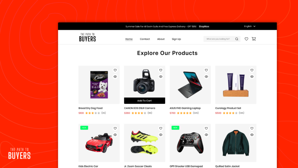
How to Create an Engaging Homepage for Your E-Commerce Site
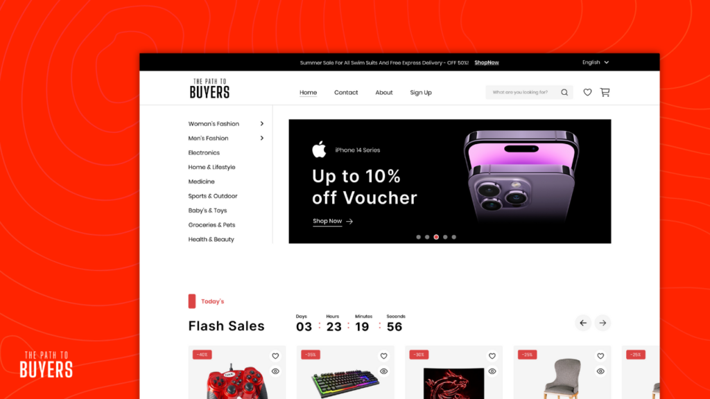
While most traffic won’t land on your homepage, it’s still a critical part of your website. Think of it as the “front door” to your online store—a navigational anchor for new visitors and a reliable starting point for returning customers searching for your brand. A well-designed homepage can guide users to products, build trust, and encourage further exploration.
Key Considerations for Building Your Homepage
To create a homepage that’s effective and user-friendly, keep these tips in mind:
- Avoid Distracting Ads: Overly aggressive pop-ups or flashy ads can frustrate visitors and lead to higher bounce rates. Keep the experience clean and focused.
- Feature a Variety of Products: Highlight a range of product types to give users a sense of your offerings. Avoid narrowing the focus too much on one category.
- Be Cautious with Carousels: If you use sliders, make sure they’re optimized for speed and usability. Avoid auto-rotating carousels that frustrate users by moving too quickly.
- Maintain Brand Consistency: Use bespoke imagery, brand colors, and fonts that align with your overall identity. Consistency builds recognition and trust.
- Monitor Site Speed: A slow homepage can drive users away. Regularly test your page using free tools like PageSpeed Insights to ensure it loads quickly.
Essential Sections for Your Homepage
To make the most of your homepage, include the following key sections:
Main Banner
This is the first thing visitors see, so it should grab their attention immediately. Use this space to feature:
- Your store’s value proposition (e.g., free shipping, quality guarantee).
- Promotions, new arrivals, or seasonal highlights.
💡 Pro Tip: Use a clean, visually appealing design with clear calls to action like “Shop Now” or “Explore Our Collection.”
Featured Products and Categories
Showcase bestsellers, seasonal items, or trending categories. Include high-quality images, concise descriptions, and direct links to make navigation easy.
💡 Pro Tip: Adding category thumbnails (visual icons or images) makes it easier for customers to find what they’re looking for. The brain processes visuals much faster than text!
Trust Signals
Reassure visitors by including:
- Customer Reviews and Ratings: Display positive feedback prominently to build confidence in your products.
- Security Badges or Guarantees: Highlight secure payment options, money-back guarantees, or other trust-building features.
Promotional Offers
Incentivize purchases by highlighting:
- Discounts and special deals.
- Free shipping or limited-time offers.
💡 Pro Tip: Use urgency, like “Offer Ends Soon,” to encourage immediate action.
Clear Navigation Options
Help users find products through three primary paths:
- Category Navigation: Easy access to product categories.
- Search Bar: Prominently placed for quick searches.
- Curated Paths: Links to collections like “New Arrivals,” “Gift Ideas,” or “Best Sellers.”
By keeping your homepage clean, visually engaging, and easy to navigate, you’ll create a welcoming and functional entry point for your store. Focus on guiding users naturally toward your products while maintaining a fast, reliable experience. Remember, simplicity and clarity win every time!
How to Design a High-Converting Product Page for Your E-Commerce Store
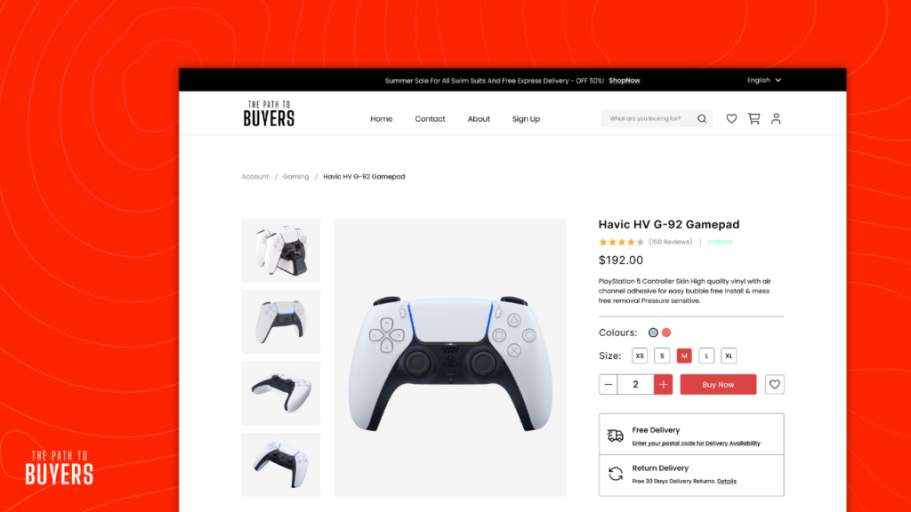
Your product page is where customers decide to buy—or leave. To win their trust and drive conversions, your page must provide a rich, clear, and engaging experience. Here’s how to design a product page that captivates and converts.
Use High-Quality Product Images
Since customers can’t physically inspect your product, images are their primary way of evaluating it. Invest in consistent, high-quality visuals to create a seamless user experience.
- In-Scale Images: Show the product in relation to common objects or people for better size context.
- Human Model Images: Include lifestyle photos to help customers imagine using the product.
- Included Accessories: Display all items that come with the purchase to manage expectations.
- Annotated Images: Add descriptive text or graphics to highlight key features directly on the images.
💡 Pro Tip: Include multiple angles, zoom functionality, and a 360° view for maximum clarity.
Clearly Display Pricing and Discounts
Your pricing should be prominent and easy to understand.
- Separate the price from other elements to make it stand out.
- Highlight discounts near the product price to show value instantly.
- Display savings as a percentage or exact amount (e.g., “Save 20%” or “Save $15”).
- If applicable, show “Price Per Unit” for products sold in varying quantities.
💡 Pro Tip: Avoid cluttering the page with redundant promotions—focus on clarity.
Craft an SEO-Optimized Title
Your product title should provide all the essential details while being SEO-friendly. Include:
- Brand name
- Product name
- Size or quantity
- Key features
For example: “Acme Waterproof Hiking Backpack – 30L, Lightweight, Durable, and Ideal for Outdoor Adventures.”
Write a Compelling Product Description
Your description should go beyond features to emotionally connect with your audience.
- Speak to Your Customer: Address their needs and desires directly.
- Focus on Benefits: Highlight how the product solves a problem or improves their life.
- Be Specific and Vivid: Use sensory language to bring the product to life.
- Provide Proof: Back up claims with certifications, awards, or testimonials.
- Tell a Story: Share the product’s journey or help customers envision using it.
💡 Pro Tip: Use bullet points, short paragraphs, and headers for easy scanning.
Make Shipping Costs and Times Clear
Hidden shipping costs are a top reason for cart abandonment. Display shipping details prominently near the “Buy” button:
- “Free Shipping” offers or thresholds.
- Delivery times or estimated arrival dates.
- Total order costs (including taxes, if possible).
Organize Features and Specifications
For technical products or items with many specs, group them into subsections with clear titles.
- Use visuals like icons or shaded backgrounds to make the data easier to scan.
- Avoid overwhelming users with long lists—use a multicolumn layout cautiously.
Incorporate Social Proof and Reviews
Customer reviews are powerful trust-builders.
- Only display reviews from verified buyers.
- Respond to negative reviews to show attentiveness and care.
- Highlight average ratings and key testimonials near the product description.
Bonus Features to Boost Engagement
- “Save” or Wishlist Options: Allow users to save products for later.
- Return Policy Access: Link to or display your return policy directly on the product page.
- Social Sharing: Add buttons for customers to share your product on social media.
By combining visually engaging elements, clear pricing, emotional storytelling, and practical details, your product page will stand out and encourage customers to click “Buy.” Focus on creating a seamless, informative, and trust-building experience for maximum conversions.
How to Make E-Commerce Category Pages User-Friendly
Category pages serve as gateways to specific product groups, offering an overview of options and guiding users toward relevant subcategories or product listings. While they aren’t necessary for every product type, well-designed category pages can streamline navigation and improve the shopping experience. When poorly executed, however, they may frustrate users by adding unnecessary steps.
Use Vertical and Horizontal Menus
Combining vertical and horizontal menus provides shoppers with multiple navigation options, catering to different browsing preferences. A dual-menu approach ensures that users can quickly locate their desired categories, improving their overall experience and increasing conversion rates.
💡 Pro Tip: If your platform supports dual navigation, make sure both menus are intuitive and visually distinct for clarity.
Optimize Filtering Options
Filtering is essential for stores with large inventories, allowing users to narrow down their options quickly. Effective filters should include attributes like price, brand, size, and color.
- Ensure filters are easily accessible, especially on mobile devices.
- Accurately tag products to avoid irrelevant results.
- Use clear, concise labels for filter categories.
💡 Pro Tip: Test your filtering system regularly to ensure it delivers accurate and helpful results.
Enable Sorting by Popularity
Allowing users to sort products by popularity can help them identify bestsellers, which are often seen as trustworthy choices. This feature simplifies decision-making and caters to customers seeking recommendations based on social proof.
💡 Pro Tip: Offer additional sorting options, such as price or ratings, and allow users to switch between grid and list views for a customized browsing experience.
Add Intermediary Category Pages
For broad categories, intermediary pages with subcategory thumbnails, brief descriptions, and links to relevant guides can serve as a helpful starting point. These pages reduce overwhelm by segmenting options and providing context for the user’s next step.
Write Category Descriptions
Concise, informative category descriptions help shoppers understand what they’ll find within a section while boosting SEO. Incorporate primary and secondary keywords naturally to improve search engine rankings. A clear, engaging description can guide users to the right area of your site and provide added value.
Include a Quick Shop Option
Quick shop features allow users to view and purchase products directly from the category page without navigating to individual product pages. This streamlines the shopping process and improves product discovery.
Offer Buying Guides and Quizzes
Integrating buying guides or quizzes on category pages helps customers who are unsure about their purchase. These tools provide personalized recommendations, explain product specifications, and highlight features, making it easier for users to make informed decisions.
💡 Pro Tip: Focus these tools on popular categories where customers may need extra guidance, such as electronics, home goods, or fashion.
By optimizing navigation, filters, and content, your category pages can act as powerful tools for enhancing the shopping experience. Keep them clear, concise, and focused on making product discovery as seamless as possible.
How to Improve the Checkout Experience on Your E-Commerce Site
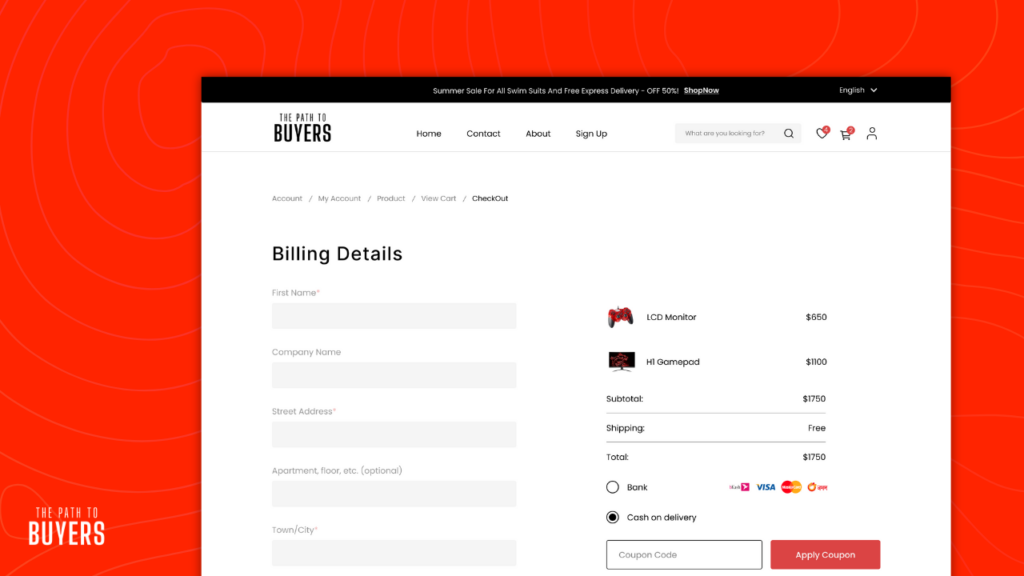
A seamless and user-friendly checkout process is crucial for reducing cart abandonment and increasing conversions. When done right, it transforms hesitant shoppers into loyal customers. Here’s how to optimize your checkout experience:
Simplify the Process
Keep your checkout process short and intuitive. Minimize unnecessary steps and distractions, and only ask for essential information. A single-page checkout or progress indicator can make the process feel quicker and more manageable.
💡 Pro Tip: Test your checkout flow regularly to identify and eliminate friction points. Do this by user testing or regularly checking screen recording with tools like Hotjar.
Offer Guest Checkout
Not all customers want to create an account. Providing a guest checkout option respects their time and reduces barriers to completing a purchase. You can always invite them to create an account after their order is placed.
Provide Multiple Payment Options
Cater to a wide range of preferences by offering diverse payment methods, including credit cards, digital wallets like PayPal or Apple Pay, and “buy now, pay later” options like Afterpay. This flexibility can significantly increase conversion rates.
Display Trust Signals
Reassure customers about the security of their personal and payment information by including trust signals, such as SSL certificates, encryption badges, or third-party security certifications. Adding customer reviews or testimonials can also build credibility.
Be Transparent About Costs
Show all costs upfront, including taxes, delivery fees, and discounts. Transparency prevents unpleasant surprises at checkout and builds trust with your customers.
💡 Pro Tip: Use a cost breakdown summary visible throughout the checkout process to keep things clear.
Optimize for Mobile
Most shoppers complete purchases on their mobile devices. Ensure your checkout process is fully optimized for smaller screens with touch-friendly buttons, simple forms, and easy navigation.
Offer Incentives
Encourage hesitant buyers to complete their purchase by offering perks like free shipping, discounts, or bonus items. Highlight these offers prominently during checkout.
Use Clear CTAs
Your calls to action (CTAs) should be straightforward and prominent. Buttons like “Proceed to Payment” or “Place Order” should stand out visually and guide the user effortlessly through the process.
Highlight Return Policies
A clear, hassle-free return or cancellation policy can reassure buyers, especially first-time customers, and reduce hesitation at checkout.
By addressing these key areas, you can create a checkout experience that is smooth, secure, and optimized for conversions. A thoughtful, customer-centric approach ensures that your shoppers feel confident throughout the process.
How to Optimize the Cart Page for Your E-Commerce Store

Your cart page is a pivotal step in the shopping journey. An effective design ensures customers feel confident and ready to proceed to checkout. Here are strategies to optimize your cart page for maximum conversions:
Show a Clear Summary
Provide a detailed yet straightforward summary of the items in the cart. Include:
- Product names, images, and key details (like size or color).
- Quantity and the ability to adjust it.
- Individual prices and a subtotal.
💡 Pro Tip: Use clean, organized formatting to make this information easy to scan.
Allow Easy Edits
Empower users to update their cart directly. This includes:
- Adjusting quantities.
- Removing items.
- Quickly navigating back to product pages if needed.
A user-friendly editing process minimizes frustration and keeps customers engaged.
Highlight Costs
Transparency is critical. Clearly outline:
- Taxes.
- Shipping fees.
- Discounts or promotions.
Displaying these details upfront reduces the chance of cart abandonment caused by unexpected charges.
Include a Call-to-Action
Guide customers to the next step with prominent, action-oriented buttons like:
- “Proceed to Checkout” (make this stand out visually).
- “Continue Shopping” (to encourage further browsing).
💡 Pro Tip: Place the primary CTA in a highly visible spot, such as above the fold.
Add Trust Signals
Reassure customers with:
- Secure payment icons (e.g., SSL or encryption logos).
- Reviews or testimonials displayed subtly near the cart summary.
Building trust at this stage can alleviate hesitation.
Offer Save for Later Options
Sometimes, customers aren’t ready to buy everything in their cart. Provide a “Save for Later” option to keep items accessible without pressure. This feature also encourages return visits.
Make It Mobile-Friendly
As you already know by now, a significant portion of online shopping happens on mobile devices. Ensure your cart page:
- Loads quickly.
- Has touch-friendly buttons for editing or proceeding to checkout.
- Displays all critical information clearly without excessive scrolling.
💡 Pro Tip: Test your cart functionality on various devices to ensure a seamless mobile experience.
By focusing on clarity, flexibility, and customer trust, an optimized cart page can reduce abandonment and improve overall conversions. A well-thought-out design ensures shoppers feel secure and ready to complete their purchase.
How to Write an About Us Page for an E-Commerce Business

An “About Us” page is your chance to make a lasting impression. It’s a way to connect emotionally with your audience, build trust, and showcase what makes your brand unique. Here’s how to craft a page that resonates with customers:
Tell Your Brand Story
Your story is the heart of your brand. Share how your business began and what inspired you to start it. Whether it was born out of a personal passion, a desire to solve a problem, or a mission to make a difference, your journey makes your brand relatable.
💡 Example: “Our story started in a small garage, fueled by a passion for sustainable fashion. Today, we’ve grown into a global community of eco-conscious shoppers.”
Include your mission, values, and vision. Explain how your products or services align with your customers’ needs or aspirations. Show that your brand stands for something meaningful.
Incorporate Social Proof
Nothing builds credibility like validation from others. Include:
- Customer Testimonials: Highlight genuine feedback that speaks to the quality and value of your products.
- Media Mentions: If your brand has been featured in press or recognized with awards, showcase it proudly.
- Partnerships: Mention collaborations with reputable organizations or businesses.
💡 Example: “Join over 10,000 happy customers who trust us to deliver the best in skincare, as featured in ‘Top Beauty Picks of 2024’ by Glow Magazine.”
Build Trust
Trust is especially critical in e-commerce. Reassure potential buyers by highlighting:
- Certifications or Awards: If your products are certified organic, cruelty-free, or won awards, mention it.
- Guarantees: Offer peace of mind with clear policies like money-back guarantees or free returns.
- Behind-the-Scenes Insights: Share details about your team, manufacturing process, or sourcing practices to emphasize transparency.
💡 Example: “We handcraft each product using ethically sourced materials and partner with local artisans to ensure sustainable practices.”
How to Design a Contact Us Page for Your E-Commerce Site

Your “Contact Us” page is essential for customer support. Here’s how to make it user-friendly:
Make It Easy to Contact
Include several contact methods—email, phone number, and a simple contact form. For instant support, consider adding a live chat option. Ensure all options are clearly visible.
Set Expectations for Response Time
Let customers know when they can expect a reply. For example, “We aim to respond within 24 hours, Monday through Friday, 9 AM to 5 PM (EST).”
Provide Additional Contact Information
If possible, include social media links or a direct phone number for urgent inquiries.
Clear Call-to-Action
Use inviting language like, “We’re here to help—get in touch with us!” to encourage customers to reach out.
How to Create a Blog to Drive Traffic to Your E-Commerce Store
An e-commerce blog can be a valuable tool to engage your audience and drive traffic to your store. Here’s how to make it work for you:
Write for Your Audience
Know your target customer and create content that speaks to their interests, pain points, and needs. Whether it’s product tutorials or lifestyle advice, ensure your blog offers real value to keep readers engaged and guide them toward making a purchase.
Always Link Your Products
Incorporate product links naturally within your blog posts. Whether you’re offering tips, sharing stories, or discussing product features, include calls-to-action (CTAs) that guide readers to your product pages. For instance, if you write about “5 Ways to Use Our Organic Skincare Line,” link to the relevant products. This encourages readers to make purchases directly from your blog.
Link Blog Posts to Relevant Products
Cross-linking is essential. For example, if your blog covers “Eco-Friendly Shopping Tips,” add a link to sustainable products description too. This keeps shoppers one the platform and exploring your offerings, increasing the likelihood of conversions.
Quality Over Quantity
Focus on creating high-quality content that directly addresses your audience’s needs. Well-researched, valuable posts build trust, establish your brand as an authority, and encourage readers to return.
Optimize for SEO
To improve your blog’s visibility, optimize your posts with relevant keywords, meta descriptions, and alt text for images. SEO best practices help drive organic traffic, bringing potential customers to your site.
How to Make a FAQ Page for Your E-Commerce Site
A well-designed FAQ page enhances customer experience and can help reduce common queries. Here’s how to create one that adds value:
Focus on Customer Needs
Think about common questions customers have, such as shipping details, returns, or product specs. Anticipating and addressing these concerns can remove purchase barriers and improve satisfaction.
Organize Questions into Categories
Group similar questions together for easy navigation. Categories might include “Shipping and Delivery,” “Returns and Exchanges,” “Product Information,” and “Payment Methods.” This helps visitors find answers quickly.
Write Clear and Concise Answers
Keep answers short and straightforward. Use simple language and break down complex answers with bullet points or lists to improve readability.
Link FAQ to Relevant Pages
Link answers to related product pages, policies, or category pages. This improves navigation and can boost SEO. For example, link to the returns policy from an answer about returns.
Add FAQs to Product and Category Pages
Including FAQs on product or category pages addresses concerns directly on those pages. For example, electronics pages could have FAQs about compatibility or warranties. Link these to your full FAQ page for more in-depth details.
Keep It Updated
Regularly review and update your FAQ to ensure it stays relevant and addresses new concerns, enhancing its effectiveness over time.
How to Write Terms and Policies for Your E-Commerce Business
Terms & Conditions
Outline the rules for using your site and making purchases, including payment methods, shipping, and dispute resolution.
Privacy Policy
Explain what customer data you collect, how it’s used, and how you protect it. Ensure compliance with regulations like GDPR.
Return & Refund Policy
Clarify the return process, refund methods, timeframes, and any exceptions (e.g., non-returnable items).
Shipping Policy
Detail shipping options, costs, delivery times, and international shipping rules.
Cookie Policy
Inform customers about cookies on your site and provide options for managing preferences.
Terms of Sale
Cover pricing, product availability, and the order processing procedure.
Disclaimer
Limit your liability for product discrepancies or external linked sites.
💡 Pro Tip:
Use simple language, be transparent, and consult a lawyer to ensure compliance. Clear policies build trust and protect your business.
How to Improve the Search Experience on Your E-Commerce Site
For many e-commerce sites, search is the primary navigation tool customers use to find products. A well-designed search function enhances the shopping experience, reduces frustration, and boosts conversions. Here’s how to make your e-commerce search seamless and effective:
Make Search the Centerpiece of Navigation
Place the search bar prominently at the top of every page. Ensure it’s easy to use, with features like placeholder text like “Search for products…” and consider adding voice or image search options.
Prioritize Speed
A slow search function frustrates users. Ensure your search engine delivers fast results with autocomplete suggestions while users type. Speed keeps customers engaged on your site.
Enhance Search Accuracy and Relevance
Use features like:
- Autocomplete: Predict and display product names, categories, or popular searches.
- Filters and Sorting: Allow users to refine results by price, ratings, availability, or categories.
- Error Tolerance: Account for typos, synonyms, and variations (e.g., “jeans” vs. “denim pants”).
Consider Advanced Search Services
Third-party solutions like Algolia, Elasticsearch, or Doofinder offer advanced features, including AI-powered search, analytics, and customizable ranking systems. These are especially beneficial for large or complex product catalogs, though they come at an extra cost.
Mobile Optimization is Key
Ensure the search function works seamlessly on mobile devices. Use large, tappable icons, autofill suggestions, and make the search bar easy to access.
Monitor and Optimize Regularly
Analyze search data to understand common queries, zero-result searches, and popular products. Use this data to refine product descriptions, add relevant keywords, or improve search algorithms.
A fast, accurate, and user-friendly search bar can turn casual browsers into satisfied buyers.
How to Design a Footer for Your E-Commerce Site
A well-designed footer is crucial for enhancing user experience and providing easy access to important information. Here’s how to create an effective footer:
Include a Newsletter Signup
A newsletter signup form in the footer encourages visitors to stay connected with your brand. Keep it simple with a field for the email address and a clear call-to-action like “Subscribe for Updates.” This helps convert casual browsers into future customers by building your email list.
Social Media Integration
Include icons linking to your social media profiles (Facebook, Instagram, Twitter, etc.). This enables users to connect with your brand on their preferred platform, increasing engagement and keeping your brand top-of-mind. Social media integration is especially important for reaching customers who are in the early stages of the sales funnel.
Useful Links
Provide quick access to essential pages like:
- Contact Us
- Shipping and Returns Policies
- Privacy Policy
- Terms and Conditions
- FAQs
- About Us
Promotions and Trust Signals
Add any current offers or trust signals such as secure payment options, return policies, or satisfaction guarantees. These reassurances can help reduce bounce rates and encourage further exploration of your site.
Conclusion
Building a successful e-commerce site doesn’t require anything too complicated. It’s about creating a smooth, simple experience where customers can easily find what they need, feel secure, and complete their purchase without hassle.
Take the time to implement the right tools, focus on the essentials, and keep your design user-friendly. With the right approach, your site can attract visitors and turn them into loyal customers. So, now it’s time to get started. The work may seem like a lot, but taking it step by step will get you there.